
Our creative data journey
How do we combine data and creativity to develop a data driven culture with a difference?
We know that data can help us make better decisions and therefore have greater impact in the work that we do. And that visualising the data in engaging and thought-provoking ways can really accelerate that change.
But how do we make it easy and simple to capture and analyse the data when we are a small freelance team (with varying degrees of knowledge and data skills!?).
Well, in steps Alan Inman Ward, who is also Director of Insight and Operations at Active Gloucestershire. We are lucky enough to have him work with us to help tackle these questions.
Over the past six-months we have had a fresh look at how we capture and use data. Asking ourselves a range of challenging questions:
o What is data?
o What data do we currently capture?
o Where do we hold data?
o How comfortable are we with these systems?
o How can we do better?
In our first conversation we shared our anxieties around data before having an old skool post it note session to compile a list of all the places we currently keep data. Airtable/dropbox/notepads/google drive/diaries/mailchimp/eventbrite/laptops and our phones to name just a few. The process seemed daunting at first but we carried out a Data Maturity Framework assessment as a team, which was a useful way to structure the discussion and we quickly recognised there was work to be done on the tools we use.
We definitely had too many and not everyone had access or the right training. We also needed to work on building the team’s understanding of our data strategy and what we want from the data to help achieve our goals.
The process also revealed one of our fears (aargh it’s all a hot mess!) and created a priority to change that (i.e. massive clear out and re-structuring of our filing system).
By beginning to streamline the tools we use - we have simplified our processes which in turn saves time and money. We updated our data protection policy and we all feel more confident that we know what we have and that it is stored safely and securely.
From collection to visualisation
These early, honest conversations helped build a culture of questioning around data. What data we collect, what we shouldn’t collect and what data we have to collect for our funders as well as thinking about how we can use the learnings in more interesting and engaging ways.
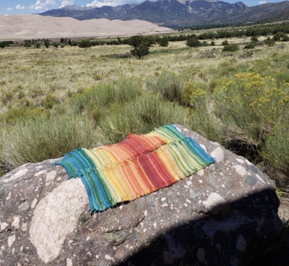
We had an experiential session where we each drew a data scarf based on what we had been up to and how we felt over the Jubilee weekend in June. By colouring each type of event in a different bright colour we could each see clearly what situations had energised us and what hadn’t. In the picture to the right you can see the high energy points were ‘seeing friends’ and ‘being physical’ and the lows were spent ‘working on the computer’.
Alan also surprised us by turning all of our CG events data from 2021 into music, using twotone which is a free open-source web app . He used the event date and number of people involved to create the sounds. Press play to have a listen:
The team now see data in a different light and regularly share examples of interesting perspectives on data. Such as the infamous survivorship bias example of where to reinforce WW2 planes to increase their chance of survival.
What’s next?
Our data journey has been building in excitement and creativity. The new way we’re collating and analysing data required for the Arts Council has been revolutionary, and will save countless hours next time. We’re enjoying trying out creative ways to visualise data at our team huddles, and looking forward to involving more of our network across Gloucestershire in our journey, starting with our next data hackathon.
Get in touch with us to share your own creative data journey. Connect with us on our Instagram page, where we’ll share more examples of our data visualising, or follow our blogs for future updates on our journey.
Useful resources and inspiration
Two Tone - A free open-source web app to turn data into music
Data Maturity Framework - Can help organisations use data for better decisions and greater impact. Data Orchard combines specialist skills in research, statistics and data with a passion for making the world a better place socially, economically and environmentally.
Data Scarves. In 2019, crafters across the US partnered with the Tempestry Project to create scarves that represented temperature data for some of their natural parks. Using a simple colour coding system they knitted scarves that showed climate change through the different coloured wool in different years.
Have a go.
You can make your own “data viz” scarf or other creative data visualization. Find some data that interests you, such as the number of arts subjects offered in schools or people attending your events, and then graph the data for a over a period of time. After colour coding the data, you can visualise it on paper, a knitted scarf or anything else.

Alan with his data scarf

One of the team drew the highs and lows from their weekend in data ‘scarf’.
This scarf has been created by a crafter Kathleen Roderick to show climate change in the Theodore Roosevelt National Park. Temperatures in 1966 on left, 2016 on right. Image credit: Kathleen Roderick and the the National Parks Tempestry Project

Survivorshop Bias. Read more at The Statistics That Kept Countless Allied Fighter Planes In The Sky
Explore CG’s Data Archive


As Create Gloucestershire delves more deeply into data and how it can support innovation and collaboration in the arts and cultural sector, we are delighted to welcome Tim Davies as a Digital Catalyst to our team.
This post explores the many different relationships between data and art, and introduces out plans for a data-art hack event later this spring.